Unified Shopping: Reducing Cart Abandonment by 28% Across 3 Banners
I led the strategy and design of a unified multi-banner shopping experience,
creating a single, seamless bag across categories and clarifying how customers qualify for free shipping in one cohesive journey.
Role: Senior UX Manager / Principal Designer / Team: Principal Designer, Content Designer, Strategist, Product Manager, Technology / Timeline: 6 months Q2-Q4 in sync with Zellers Launch / Tools Used: Figma, Figjam, Adobe Analytics, Maze User Testing, Medallia and Salesforce

Confused customers, lost revenue
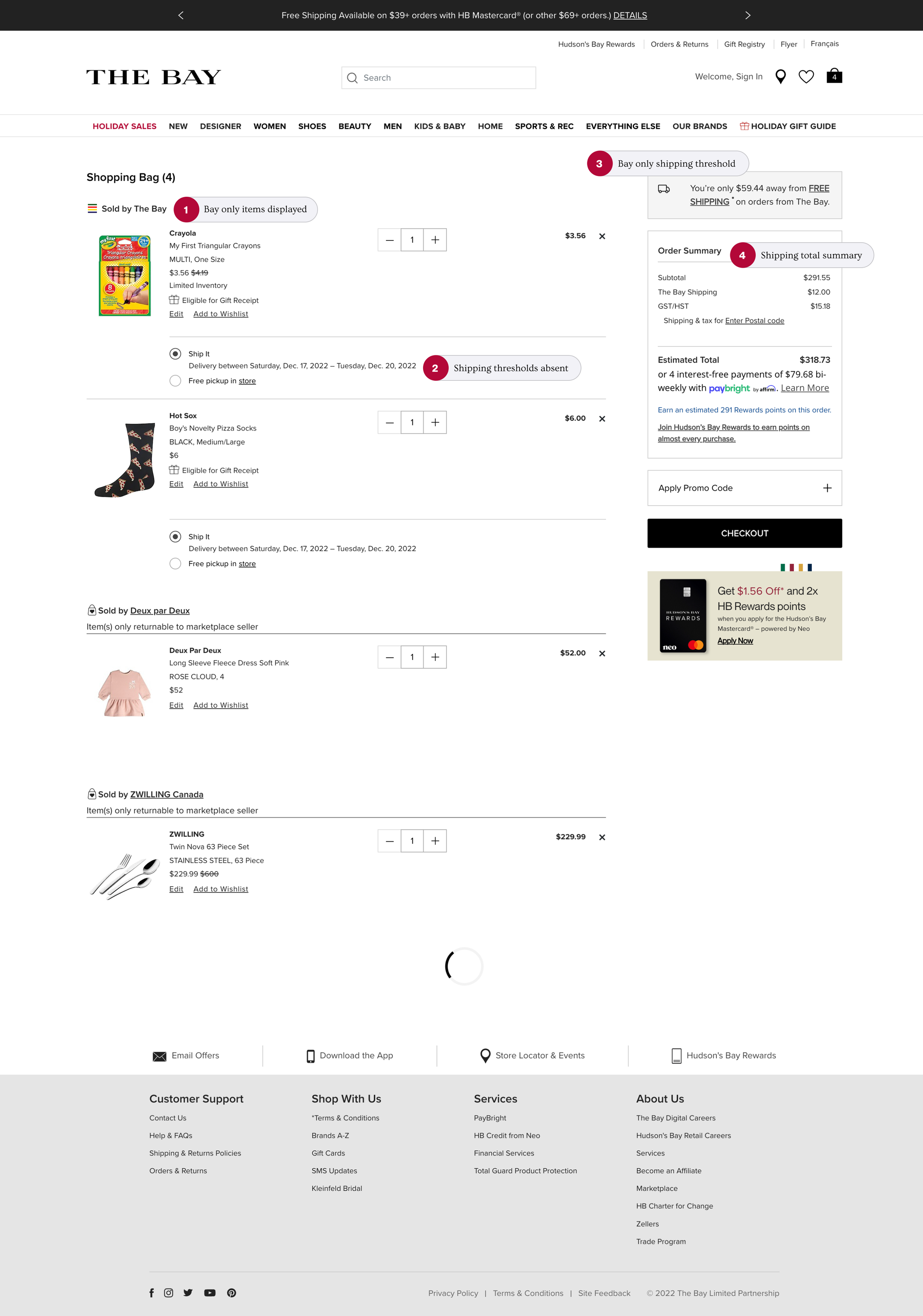
Customers couldn't see unified shipping information and cart totals when shopping at more than one banner (Zellers, Marketplace, Everyday Essentials).
-
The Challenge
Customers are being held back by the lack of clarity and confidence from cart to checkout. 42% abandonment, 73% support calls.
-
The Problem
Customers are having trouble understanding when they qualify for free shipping, on which products and when. Customer insights combined with A/B testing helped us create an informed content strategy.
-
The Solution
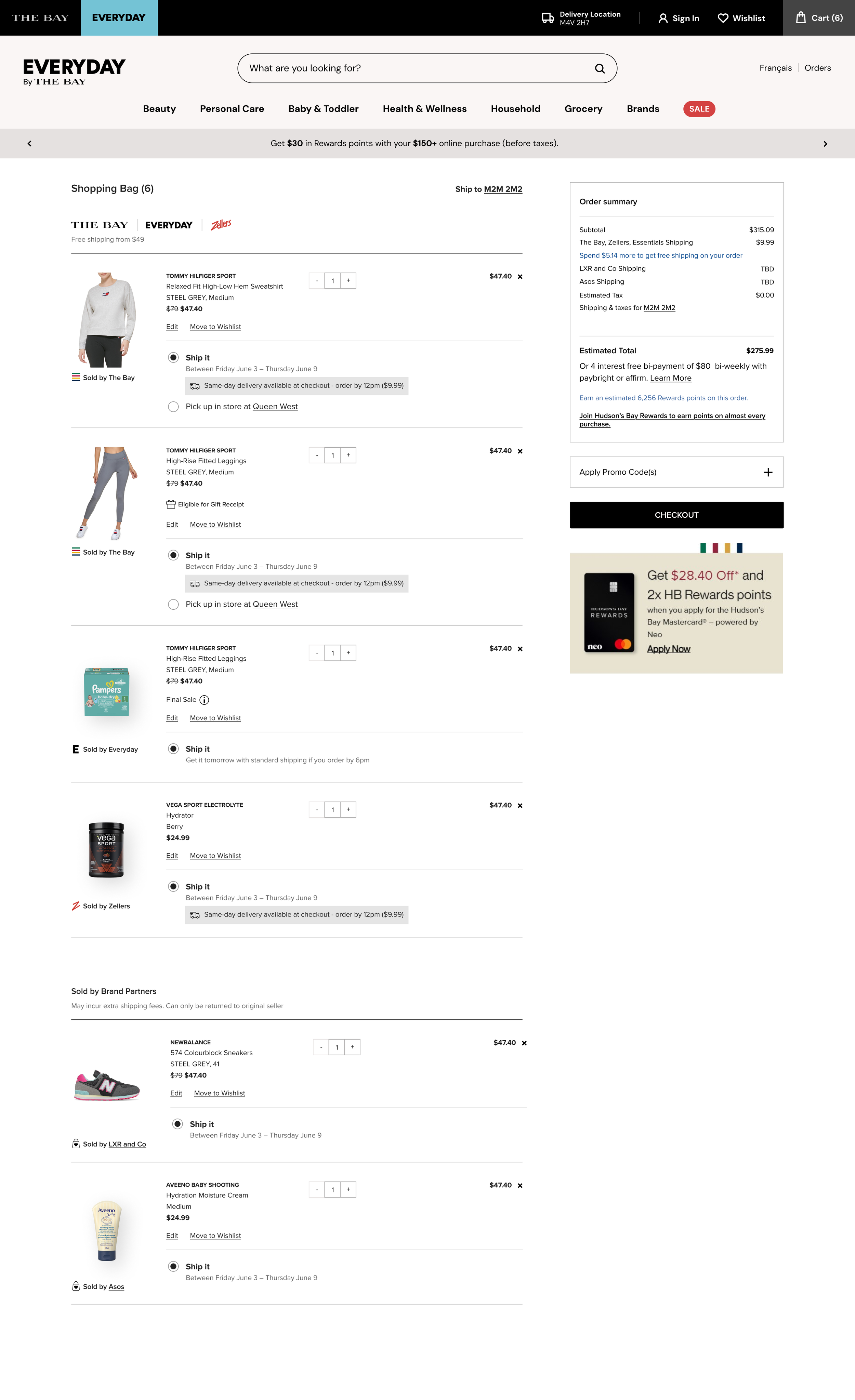
We created a unified cart showing items from all three banners with real-time free shipping trackers, reducing a multi-page checkout from 6 steps to 3, ensuring shipping information is featured prominently.

-
Research Methods
Competitive analysis: Looked at platform driven experiences across the e-commerce landscape. Conducted usability testing against existing constraints and use cases such as the upcoming Zellers launch and the updates to Marketplace thresholds still not in place.
-
Primary Research Insights
Results: 25/32 (78%) participants understood how much the shipping cost for the order would be and about 72% of participants understood what else they could do to qualify for free shipping. With 78% of participants reporting that it was easy or very easy & 1 who said it was difficult
-
Research Analysis
Based on the results, we need to speak to the items that don’t get free shipping when we mention those that do to avoid confusion. This helps us avoid setting incorrect expectations of what qualifies for free shipping.
Understanding the Problem:
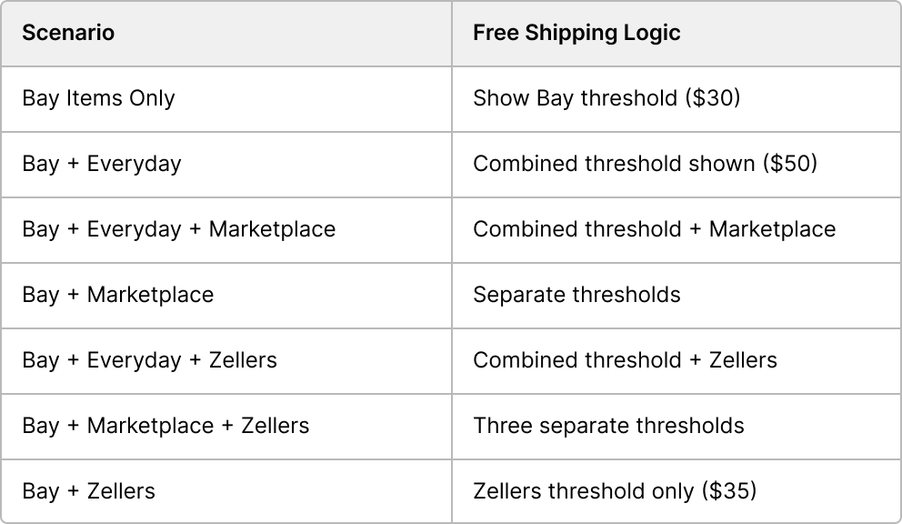
How the Cart Adapts to Different Shopping Scenarios
Our design needed to handle 8+ banner combinations intelligently:

Design Process
Reframing the Problem: Initial research revealed multiple interconnected challenges. We used "How Might We" questions to break down the problem and explore solution spaces to help inform design decisions.
-
Primary Challenge
How might we unify shopping carts across The Bay, Zellers, and Marketplace while maintaining each banner's distinct identity?
-
Core User Pain
How might we show real-time progress toward free shipping across multiple banners with different thresholds?"
-
Business Goal
How might we reduce cart abandonment by clarifying costs before customers reach payment?
-
Design Constraint
How might we simplify the checkout process without removing necessary information
Explorations
We explored and tested different zones and treatments for featuring free shipping messaging.

The Solution
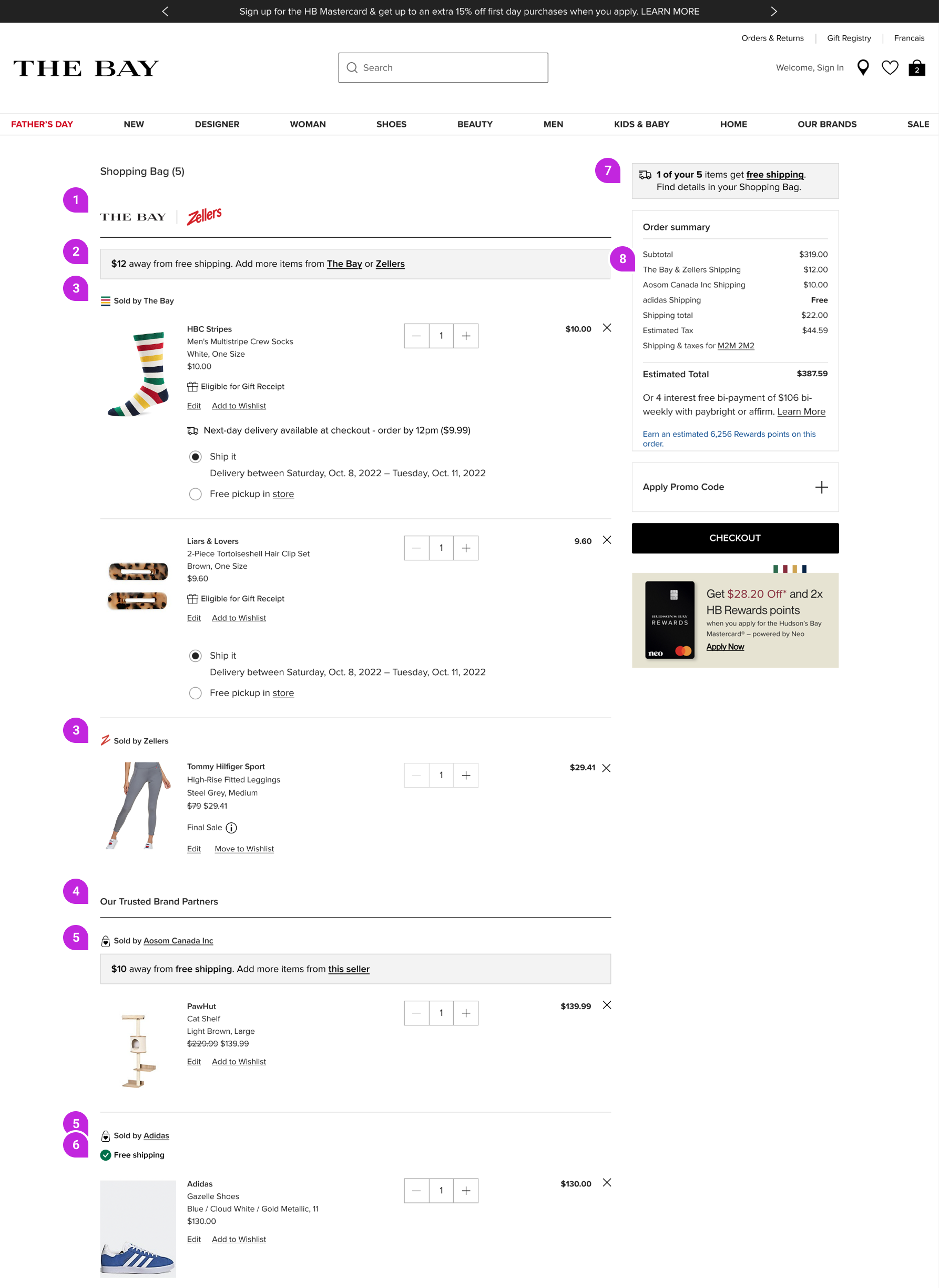
We needed to build a flexible design that could grow step by step and adjust to changes from each banner.
As a customer, I can easily tell which items belong to each banner. It’s clear when free shipping applies respectively to each banner.

Flagship banner (The Bay, Everyday, Zellers) logo placement.
In-context Free Shipping Messaging that apply to all Flagship banner items.
“Sold by” icon placed above respective items
“Our Trusted Brand Partners” tested to improve clarity for marketplace items on cart
Marketplace brand label - Sellers have their own unique thresholds respective to the brand
Free Shipping Icon and label - tested for clarity
Free Shipping summary message displaying total number of items that get free shipping
Order Summary to reflect individual and total shipping cost by banner and seller.
Results & Next Steps
Increased cart-to-checkout ratio from 16.76% to 17.63% (+87bps)
and checkout-to-order ratio from 62.69% to 63.10% (+41bps). Cart Abandonment went
from 89.49% to 76.78%. Generated an 11% increase in average order value.
Order Summary Update: Include total shipping cost as a line item.
Use a roll up for shipping total under Order Summary to reduce length and cognitive overload.
Affirm migration
