Reimagining The Bay Native iOS App
Reimagining The Bay’s Native iOS App to Drive a 50bps Conversion Increase and Improve App Store Rating from 1 ⭐️ to 4 ⭐️’s
Role: Senior UX Manager / Team: Senior UX Manager, Principal Designer, Product Designer, Product Manager, Developer / Timeline: 6 months + / Tools Used: Figma, Figjam, Medallia VoC, Google Lighthouse, Maze and Miro
-
The Challenge
Customers are held back by poor performance and cumbersome flows that have left our app lagging behind the rest of our platform.
-
The Problem
Our data and analytics show that mobile has become the device of choice when making purchasing decisions. The number of App users has gone down with that number steadily increasing for cart abandonment rates by 15,7%.
-
The Solution
Build a native iOS app leveraging The Bay Design System and iOS-specific features to ensure optimal performance. Integrate key functionalities from our web platform while maintaining consistency across all cross banner touch-points.
Previous State of the Experience
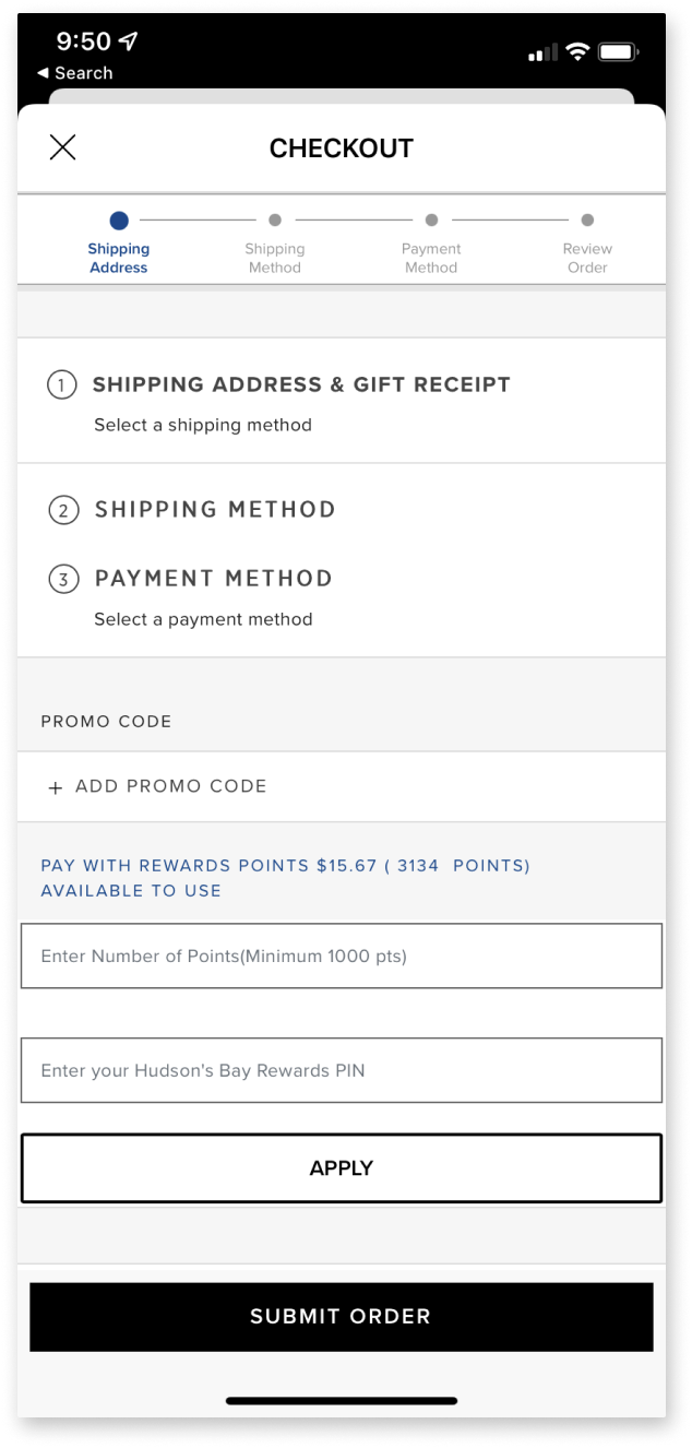
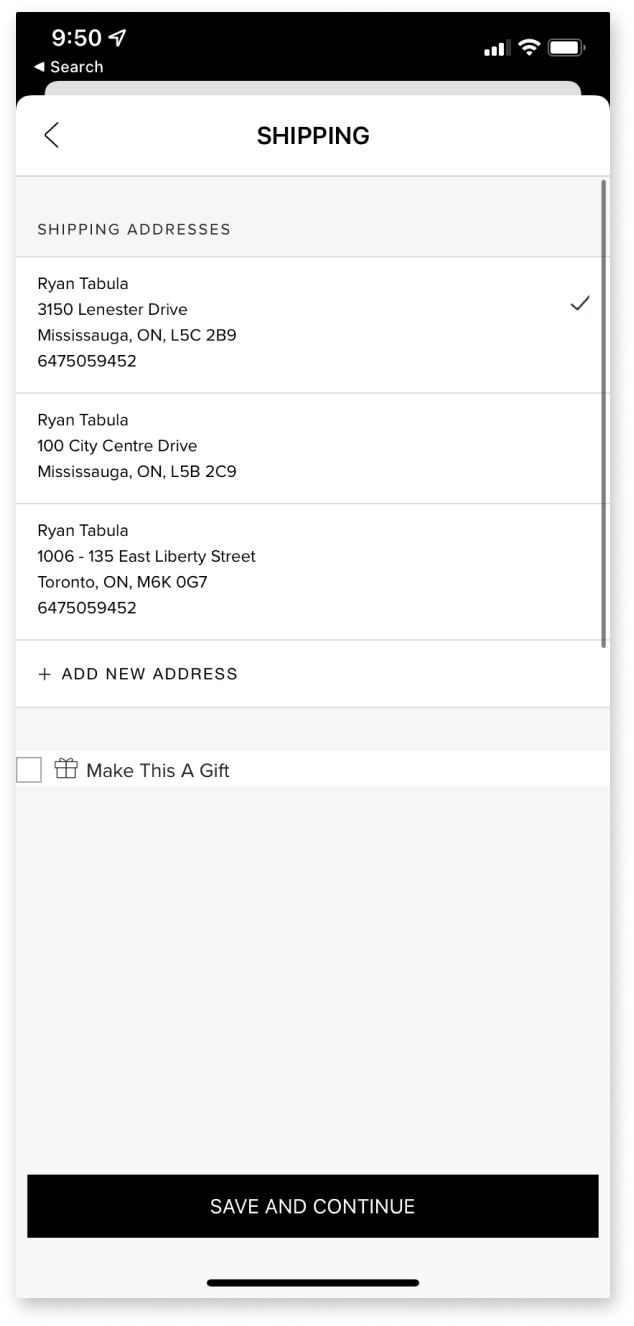
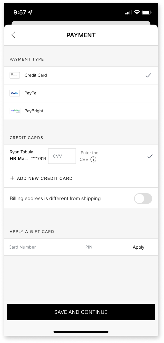
According to Voice of the Customer (collected through our Medalia Survey) navigation is unintuitive. The journey from browse to checkout is cumbersome, resulting in drop offs and abandoned carts.


-
Context
The Bay’s mobile shopping experience was underperforming compared to desktop traffic. Conversion sat at only 1.7%, with rising cart abandonment due to a poor-performing app and fragmented flows. Customers increasingly prefer to research and purchase on mobile, a gap given our omni-channel strategy.
-
Problem Statement
Customers struggled to complete purchases efficiently on The Bay’s iOS app due to slow performance, unintuitive navigation, and buried key actions. These issues led to high drop-off rates of 37% during checkout and low App Store satisfaction scores (average rating: 1★). This disjointed mobile experience prevented The Bay from fully capitalizing on growing mobile commerce demand.
-
Business Goal
Create a high-performing native iOS app leveraging The Bay Design System to unify mobile and web experiences while improving conversion and satisfaction metrics.
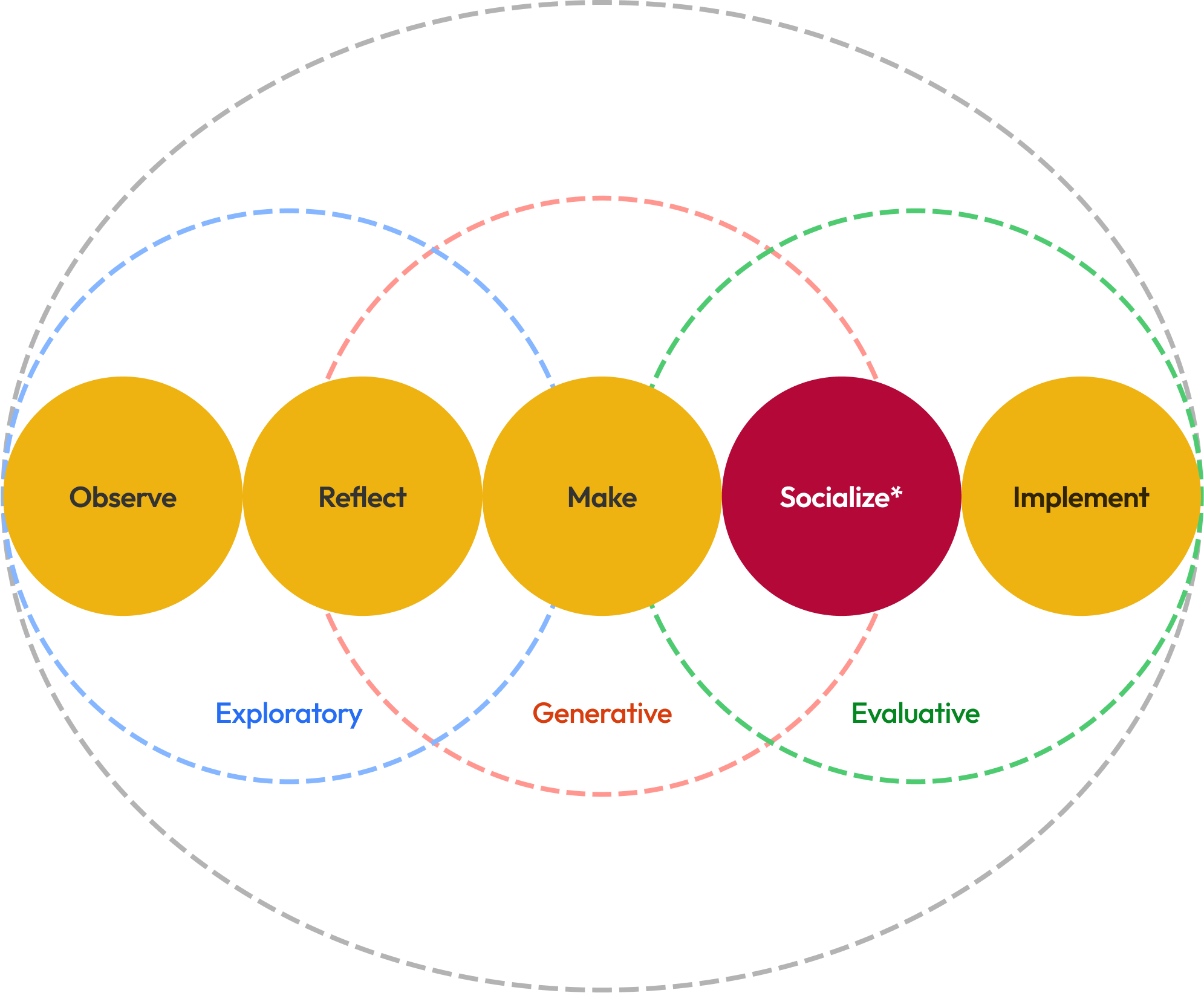
Our Research and Design Process
Throughout these phases we ensure our team and stakeholders are all aligned on the goals, the timeline and our scope.
My role in developing this framework with our lead Strategist was to help designers understand and leverage each phase from start to dev handoff.
Methods included; Voice of the Customer survey analysis (Medallia), Benchmarking top retail apps (Nordstrom, Target, Lululemon), 12 customer interviews on mobile shopping habits and a Heuristic evaluation of The Bay app navigation.
*Socialize: Sharing out concepts internally and with customers, to gauge interest & gain feedback.
Exploratory phase
In the exploratory phase, our goal is to deeply understand the context, define the problem, and connect it to the customer experience. We prioritize customer research to guide our competitive analysis, data insights, and emerging trends, ensuring these inform our UX strategies for the next phase.
Generative phase
In the generative phase, we build on insights from the exploratory phase by co-creating with customers and stakeholders. Our approach focuses on ideating and prototyping with a customer-first mindset, using business models and stakeholder feedback to guide our strategy and ensure our design solutions balance business objectives with user needs.
Evaluative phase
In the testing phase, we focus on evaluating the desirability of our concepts to understand customer reasoning better. This is where refining our goals and metrics becomes crucial, helping us land on concrete conclusions. By navigating the solution space, we identify key areas to help us stay true to our overall vision and strategy.
Design Approach
“How might we enable customers to browse, save, and purchase easily
while feeling confident and in control?”
Reduce friction: Simplify navigation, declutter checkout.
”I’d like to gather and save items in a list so I can make a decision on them later.”
Increase confidence: Add transparent cost breakdowns and faster performance.
“As a customer, I want to view
the cost breakdown so I have the finance info I need to make a purchase decision within my budget.”
Encourage exploration: Introduce saved lists and personalized recommendations.
“I’d like to manage items in my bag so I can proceed to purchase with only the items I’m interested in.”

